I was a part of Team Save the WoRld along with Faizan Haque, Javier Orraca, Sam Park, and Shruhi Desai in the OCRUG Hackathon 2019 held at UC Irvine on May 18th and 19th. (In fact, I am writing this blog post at the tail end of our time before we present our results!) The subject of the hackathon was water usage in California. We were given several data sets on water, and we were encouraged to find our own data sets if we liked too. Our objective was to produce an analysis of our choosing; what to analyze was open-ended. My main contribution was developing a model that predicted health outcomes in counties in California based on levels of pollutants measured in the water.
This analysis was a sprint, so of course our results should be taken with a grain of salt. This is more of an interesting preliminary analysis than a set of scientific conclusions. Still, it was interesting to see how much information we could extract from the data in a short time frame.
The Data
We started by finding our own data. The main predictor was levels of pollutants in the water collected by the CDC. We had data available from 2000 to 2016. One of the judges, Madeline Bauer, helped us with the suggestion that health effects from pollutants would likely not be seen until years after the pollutants were measured in the water. Further, it seems unclear that there would be a definite amount of time after the pollutants were measured that effects would show up–some people might show effects after 10 years, other after 40, etc.
Therefore, we made a simplifying assumption that the levels of pollutants in a given county were roughly uniform over time, and that the measurements over 2000 – 2016 were samples of this roughly constant number. So the input of our model was the means of these pollutant levels in the 58 counties in California.
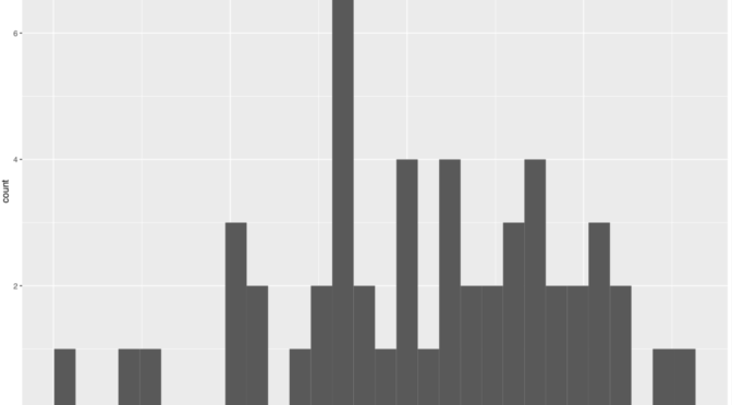
Below are histograms of the levels of pollutants.


Note that all of these variables seem to follow a distribution that is very skewed to the right. Because of that, I log-transformed these variables to get a less skewed distribution. The resulting histograms are below.


These distributions are nicer and more mound-shaped. The outcome we looked at was from County Health Rankings. We used as our response variable the percentage of people in each county who had “Fair” or “Poor” health, as measured by longevity as well as self-reported wellness. The histogram of those outcomes is shown below.

Next we looked for covariates to act as controls. We ended up collecting and using data on race (percentage of white people in each county), age (percentage of people over age 65), median income per county, and population density. We also found data on educational attainment which we did not have time to incorporate; that would be useful for a future analysis.
Lastly, on an exploratory analysis we noticed that nitrates correlated strongly with health outcomes–more strongly than seems reasonable on its face. We figured that nitrate levels would be correlated with farm activity, since nitrates occur in high levels in fertilizer and manure and can penetrate into soil. In case there are other factors related to farm land that correlated with health outcomes, we controlled for percentage of land area in each county used for farming.
Linear Modelling
The raw Pearson correlations between the predictors and the response are shown below, as well as a couple scatter plots between the pollutants and health outcomes.


It seems that poor health outcomes are fairly correlated with nitrate levels, although the correlation level is similar to percentage of land used for farming. Earnings are strongly negatively correlated with poor health outcomes, which makes sense. Percentage of population over age 65 is negatively correlated with poor health outcomes as well. To some extent this is counterintuitive, because you would expect that people over age 65 would on average have lower self-reported well-being. This is probably true, but the measurement of “fair/poor health” also takes into account longevity. Of course, counties with a higher percentage of people over age 65 are likely to also have higher longevity.
We started by fitting an ordinary least squares (OLS) model with all of our data. We also included interactions between pollutants, because sometimes pollutants can react chemically with each other and create more dangerous chemicals.

The results are shown above. It appears that the most important controls are earnings and percentage of population over 65. Therefore we fit a second linear model using only these controls.

After including only these controls, we find that nitrates seem to have a significant effect on health outcomes. Somewhat strangely, it seems that nitrate levels are negatively correlated with poor health outcomes after controlling for the other variables in both models. Also, arsenic levels didn’t seem to have a significant linear relationship after controlling for other features even though it seems like the relationship is fairly strong in the data.
Lastly, we also made a residual plot of the second model. It seems like the residuals are roughly homoskedastic and plausibly normal, despite some outliers. This suggests that a linear model is a reasonable choice for this data. In a more detailed analysis, we could have conducted a significance test like the test proposed by Shapiro-Wilk, D’Agostino, or Jarque-Bera in order to more rigorously investigate whether the residuals are pluasibly Gaussian.

Nonlinear Models
Digging deeper, we decided to consider nonlinear models. The first step was looking at the distance correlation, which measures even nonlinear correlations between features.

Note that the distance correlation between Arsenic and health outcomes is higher than the Pearson correlation. This suggests that maybe a nonlinear relationship exists in the data where a linear one did not. We decided to fit a generalized additive model to investigate possible nonlinear relationships in the variables. The results of a regression using the gam package in R are below.

Now arsenic seems to have a strong relationship with health outcomes. We also fit a model including interactions.

The relationships seem to hold up, and the interaction between nitrates and uranium also seems to be significant.
Conclusions
We tried a number of other ideas, some of which worked and some of which didn’t. In a short amount of time, it was difficult to do an in-depth analysis of the data. But we were able to extract some interesting initial findings. I may update with another post in the future talking about other things we tried and the process of working in the hackathon, but for now I need to wrap up this blog post and prepare for our presentation in an hour!